Barrelhouse 101: Gastropub Branding
Role: Creative Direction • Art Direction • Design • Sourcing
Services: Naming • Logo • Collateral • Uniform • Apparel • Experiential • Displays • Events
-
The only concept Proprietor Joby Yoby had when we sat at the table with him was good food and 100 beers on tap. The location off Highway 101’s California Street exit in Downtown Ventura seems ideal but it had proven a challenge to a string of establishments that had come before. On one hand, here was this stand-alone building easily visible to every car exiting the 101. On the other hand, the lure of Ventura’s historic Main Street with its fill of eating establishments, retail shops, and live entertainment was and remains a huge pull a few blocks away. How then could we draw people into Barrelhouse?
First, we added the number 1—both in name and on the tap wall—to Joby’s 100 other beer taps and the newly branded Barrelhouse 101 was instantly more rooted in Ventura’s mythic California coastal location. Then we drilled deeper into the city’s working class, oil boom past and created a look and a design experience that is authentic and unique as the “City of Good Fortune”. Now, pulling off Coast Highway it’s hard to miss BH101, and even harder to drive past this new landmark where there’s “Good Fortune on Tap”.
Along the Gold Coast between Los Angeles and Santa Barbara is a place to stop and experience culture and camaraderie. Welcome to Barrelhouse 101.
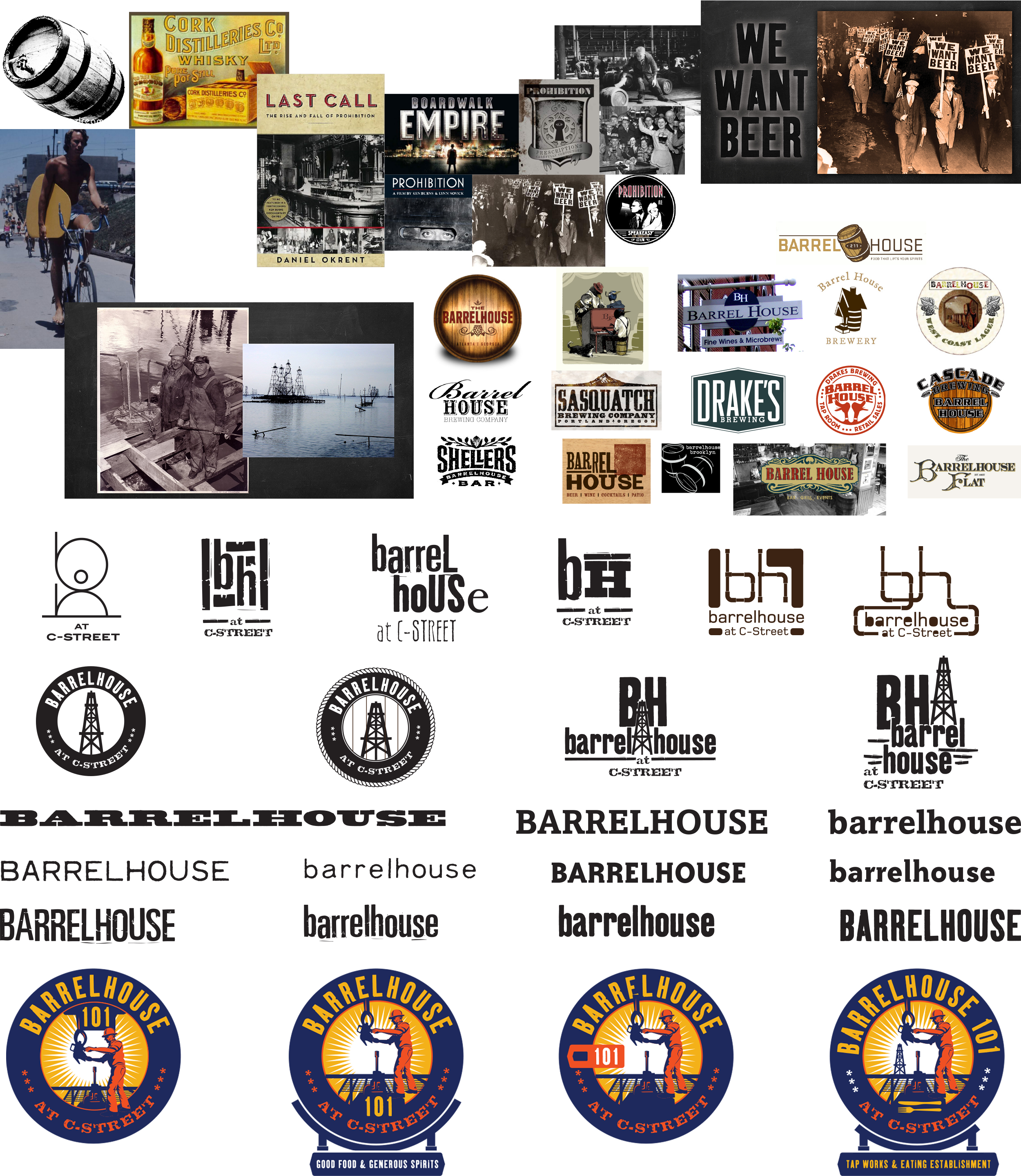
Discovery + Exploration
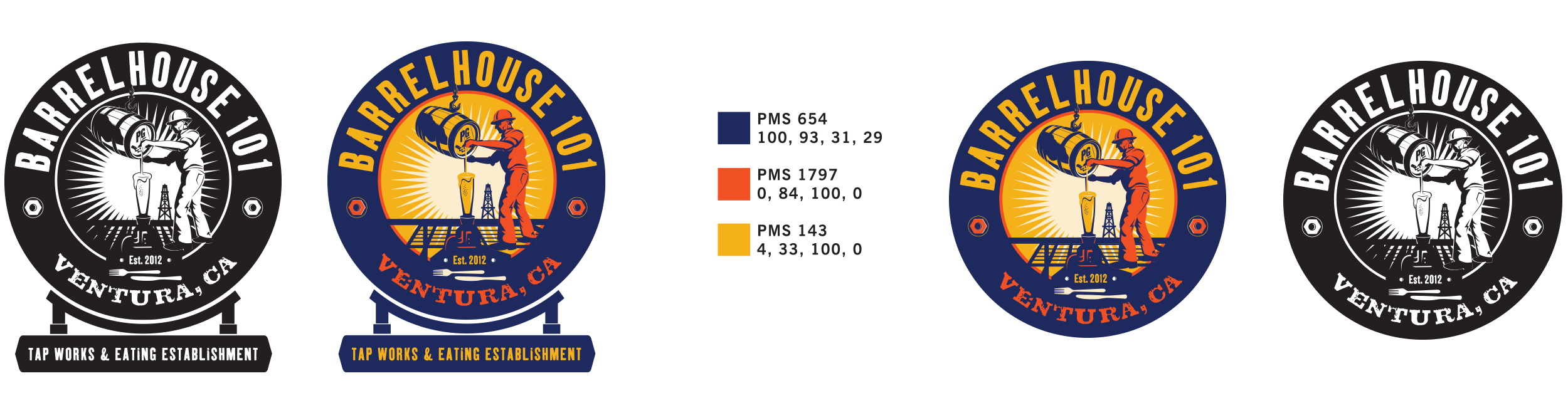
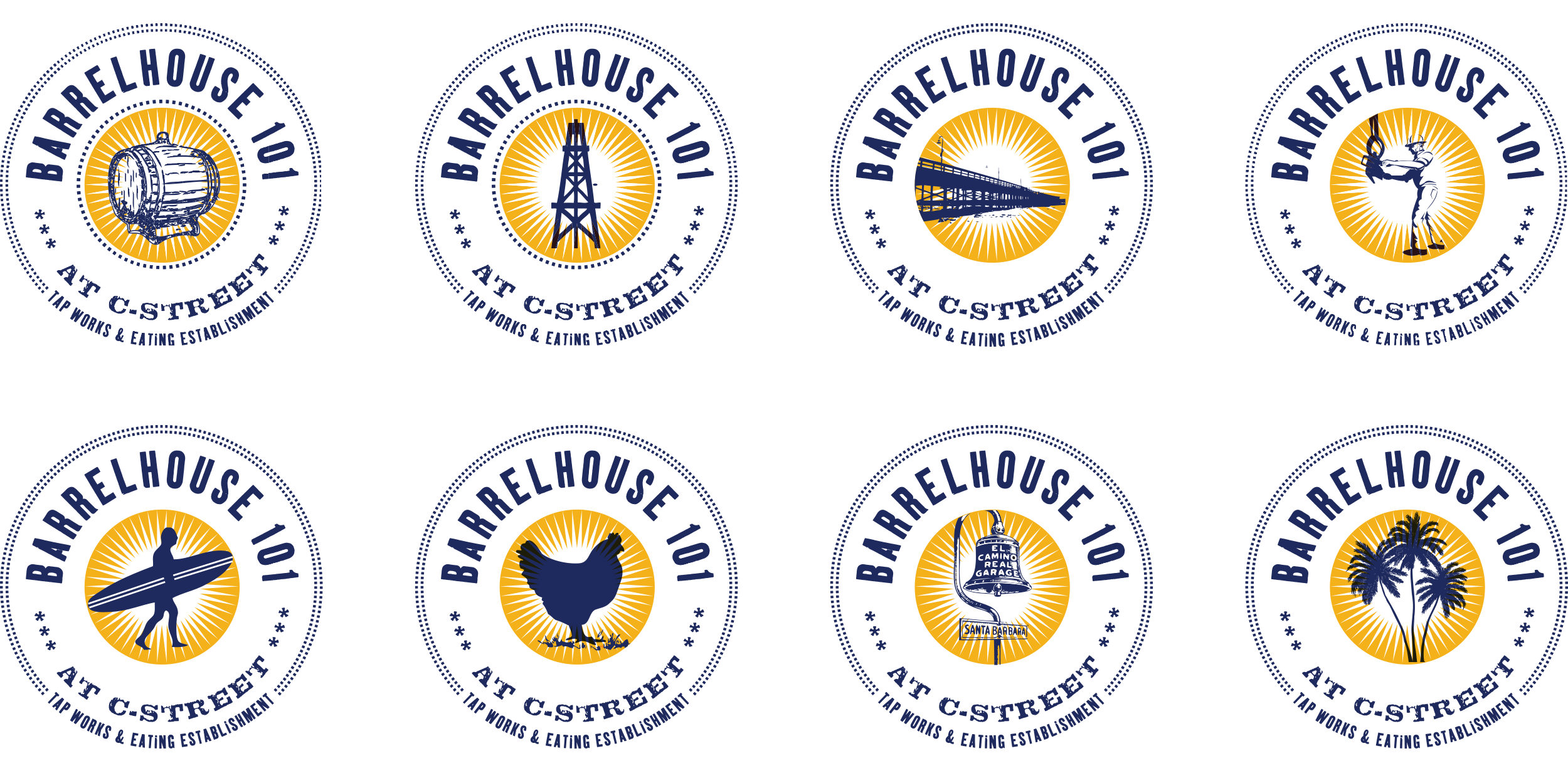
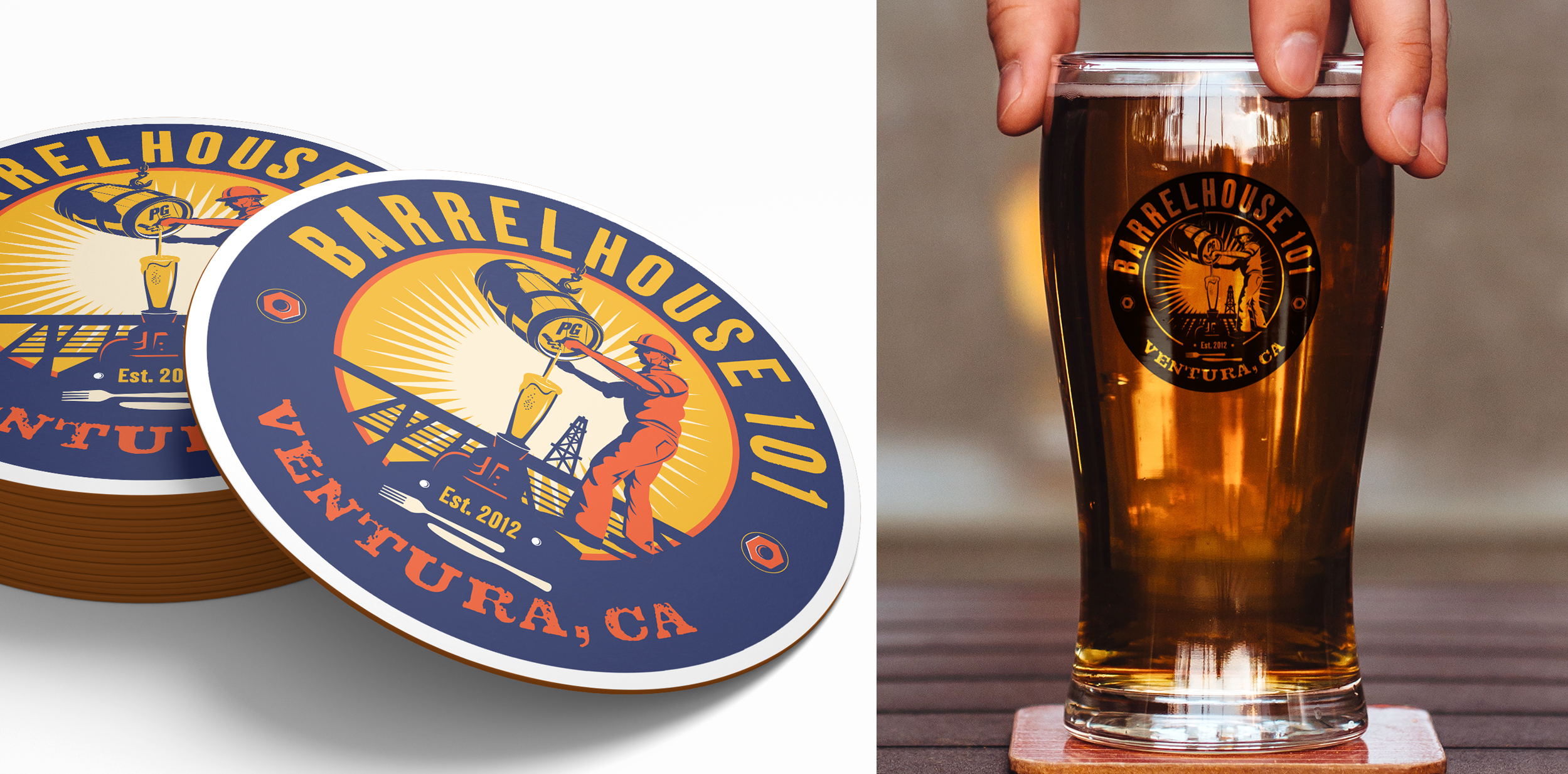
Final Main Logo
Studies of secondary branding for wall graphics, merchandise, patterns, etc. C-Street makes reference to the surf culture in the city. In the end, we did not use it to keep closer to the prohibition and oil history instead.
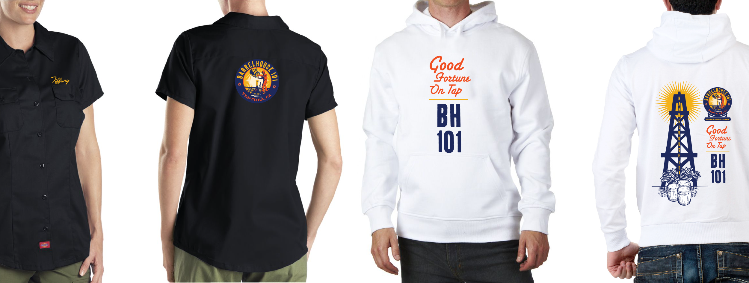
Uniform + Apparel
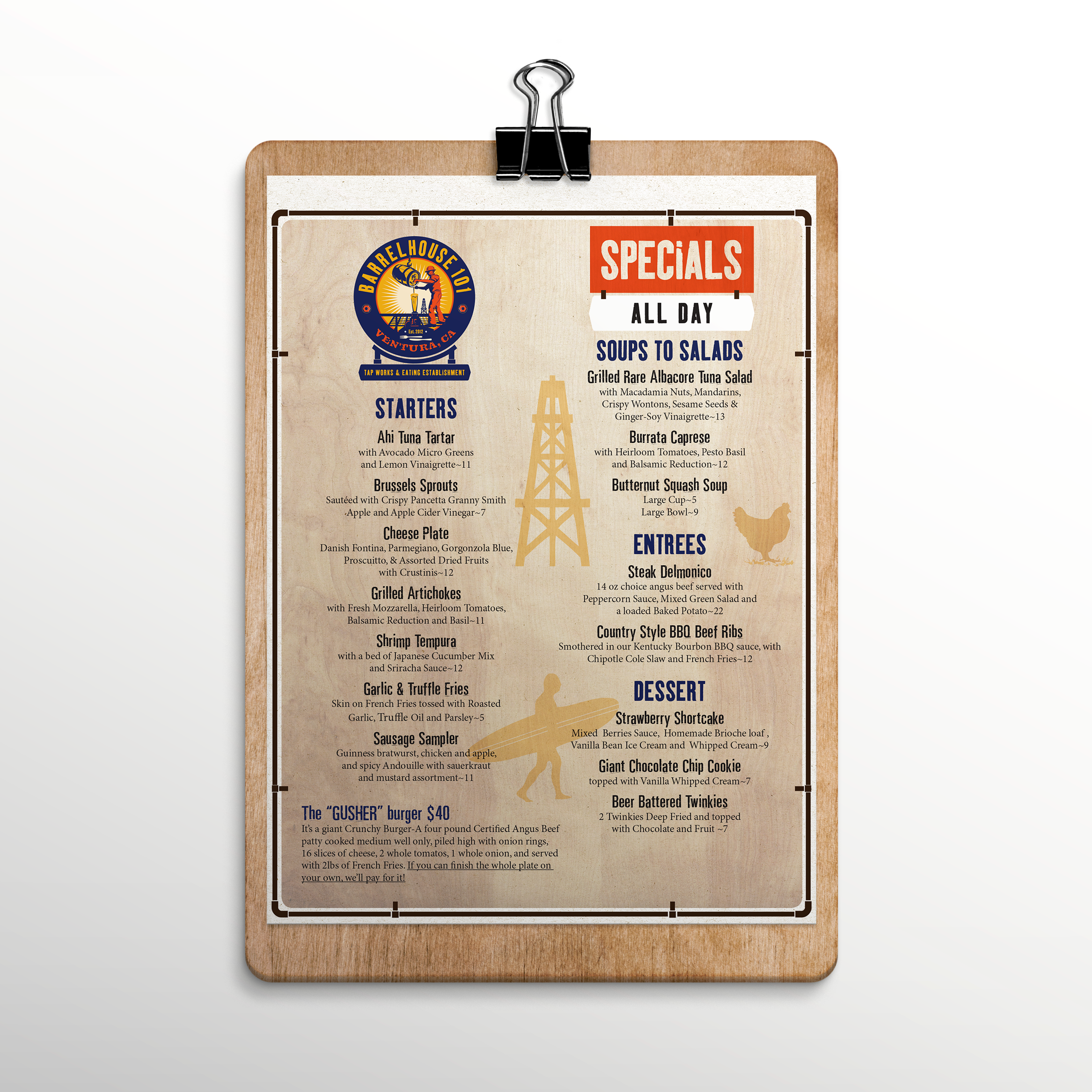
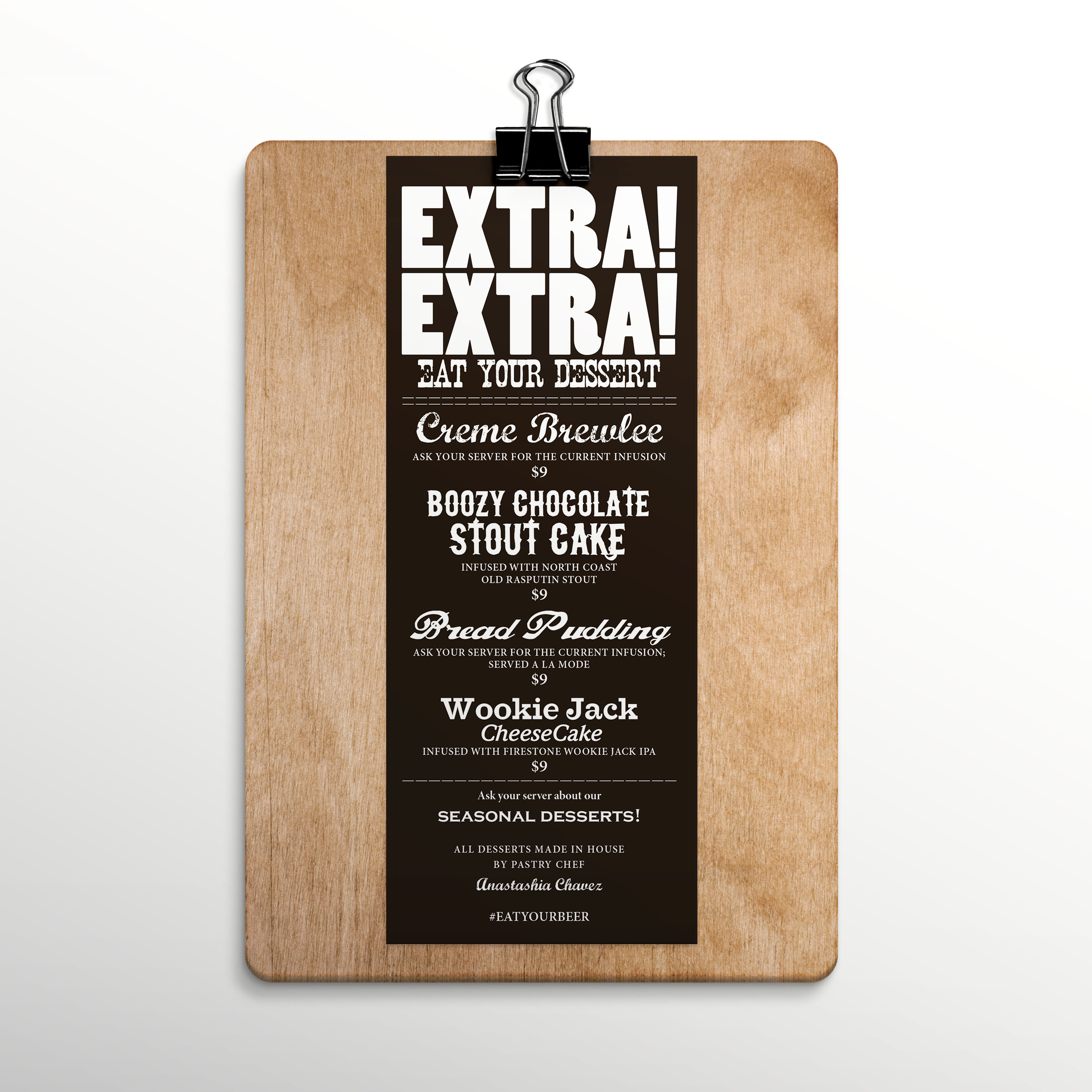
Menus
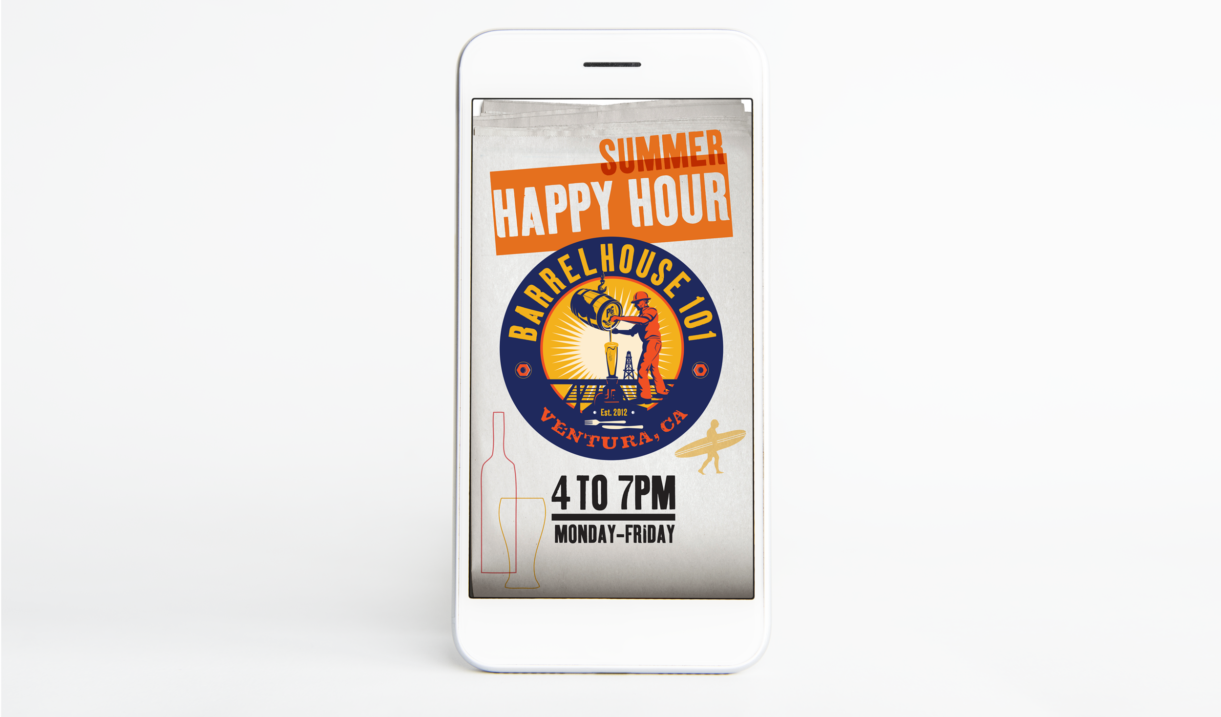
App Landing Page
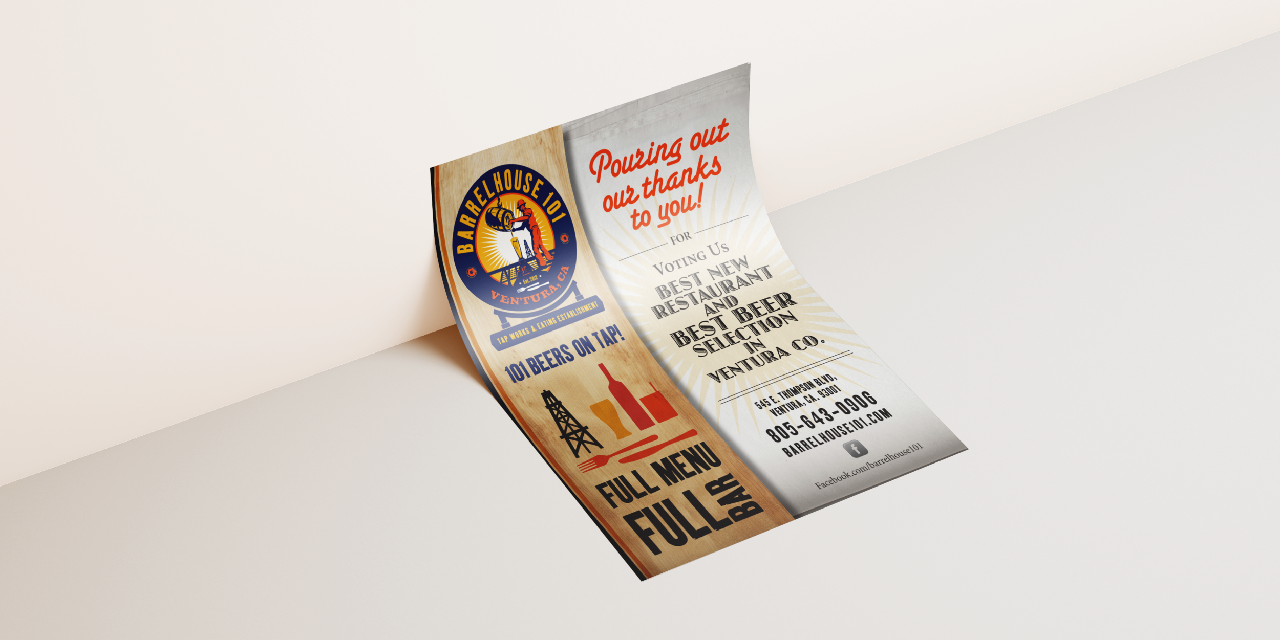
Post Card
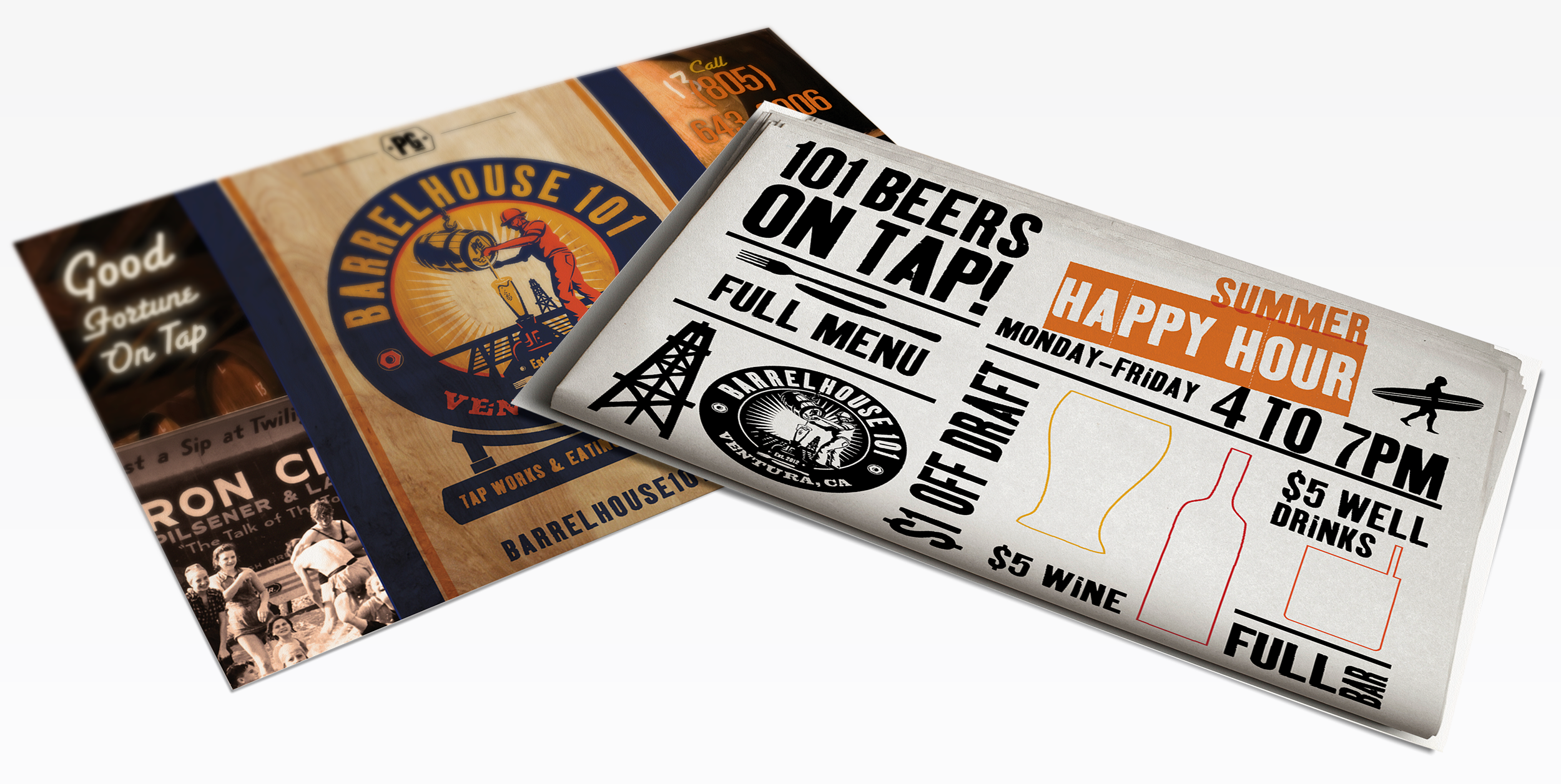
Advertising
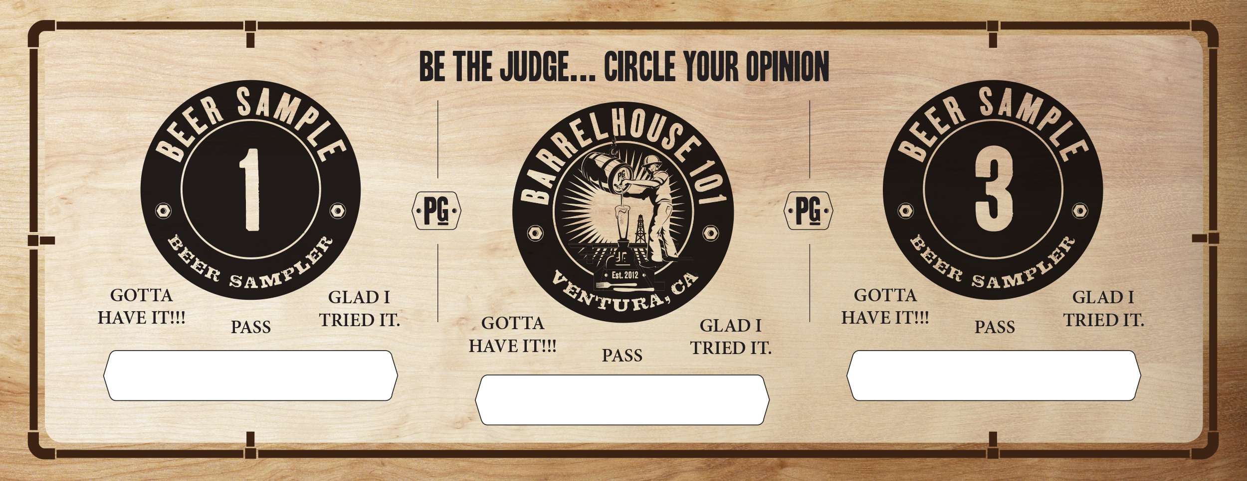
Beer Flight Tasting Mat
The BH101 main logo shape is used as a base to place each of the three beer tasting glasses. The “beer line pipe” reference makes up the border against the wood texture, a secondary element to the BH101 brand.
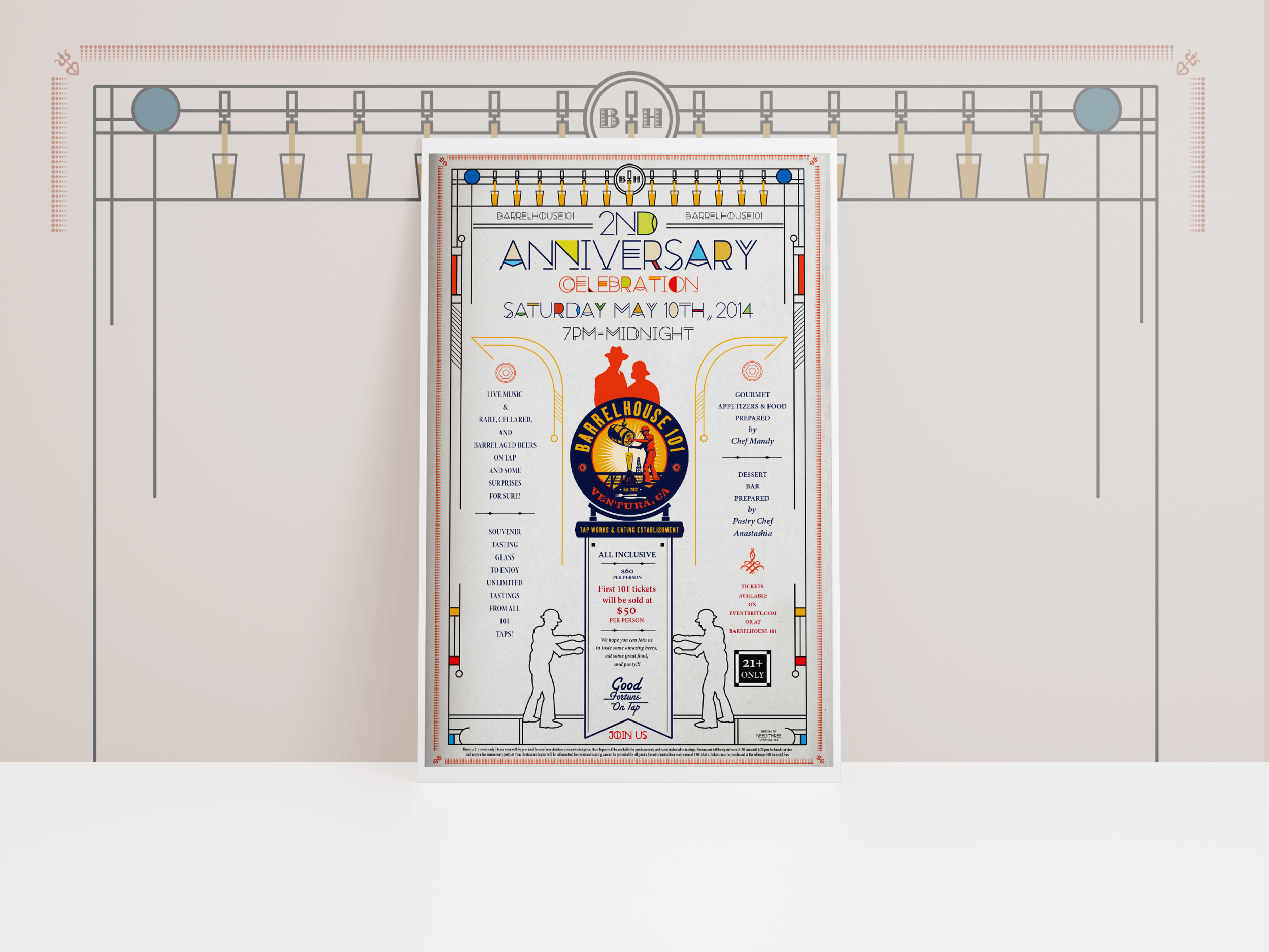
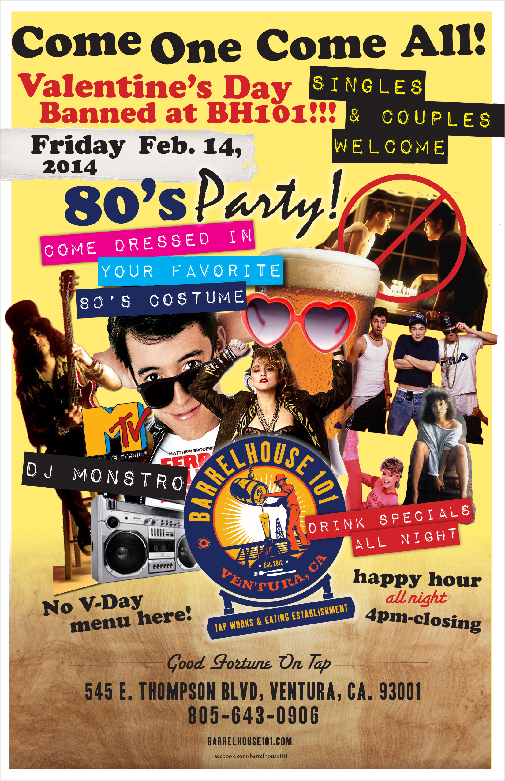
Anniversary Poster + Flyer
I was inspired to create a prohibition meets Frank Lloyd Wright look and feel. The "Bonnie and Clyde" silhouettes were taken from my bathroom sign design. Beer taps, oil worker men and a central ribbon were also incorporated to frame the main logo.
Exterior Design Phases
Aside from the new signage above the entrance, the exterior (shown below) was typical look for the City of Ventura. The challenge was to change the minds of the Design Review Board.
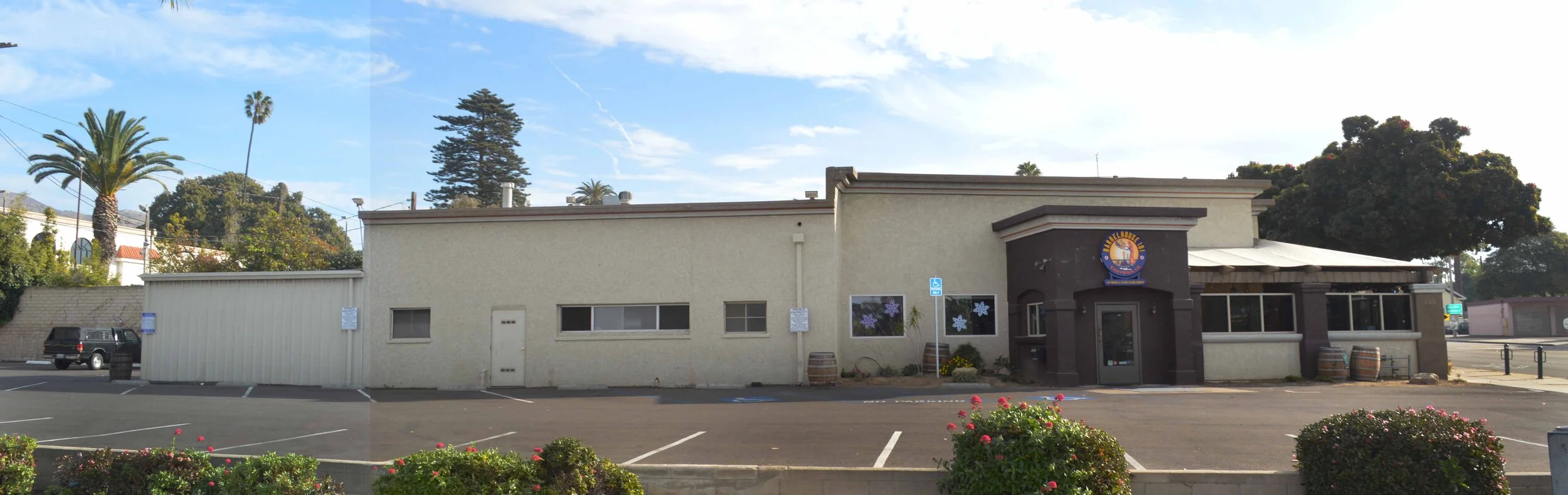
To save the customer on architectural rendering fees, I executed simple mock ups using Photoshop. The goal was to communicate visually the brand that I envisioned. Before the galvanized roofing ,siding, and copper signage where installed, some community members saw the brand colors as an Ikea look and an eye sore.
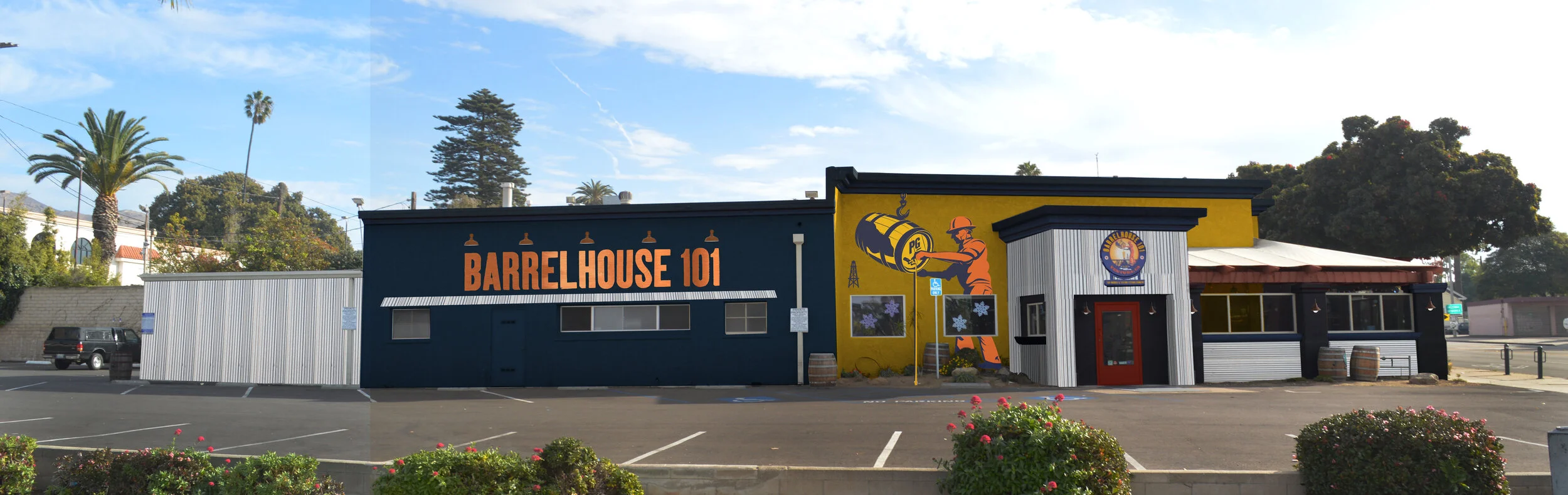
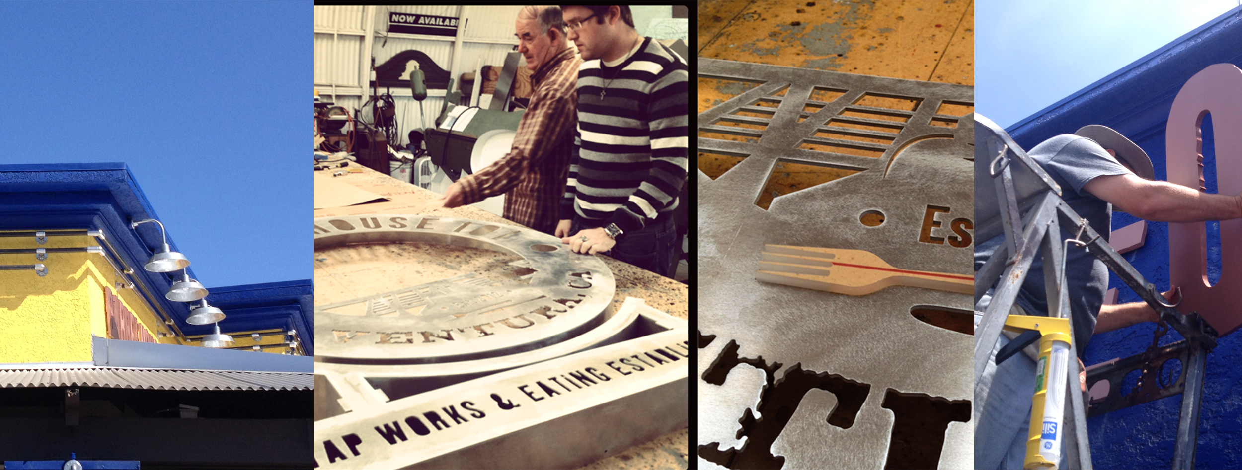
I sourced and worked with local vendors to create signage, painting, and installation—lighting, roofing, siding, pipes, and fittings.
And here is the completed design. I love the beer lines branching out of the main sign and around the building.
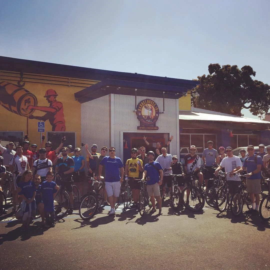
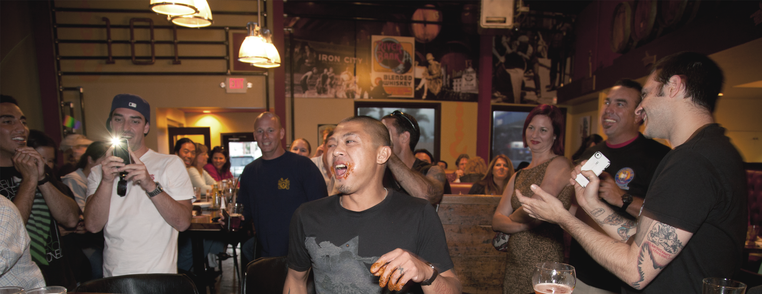
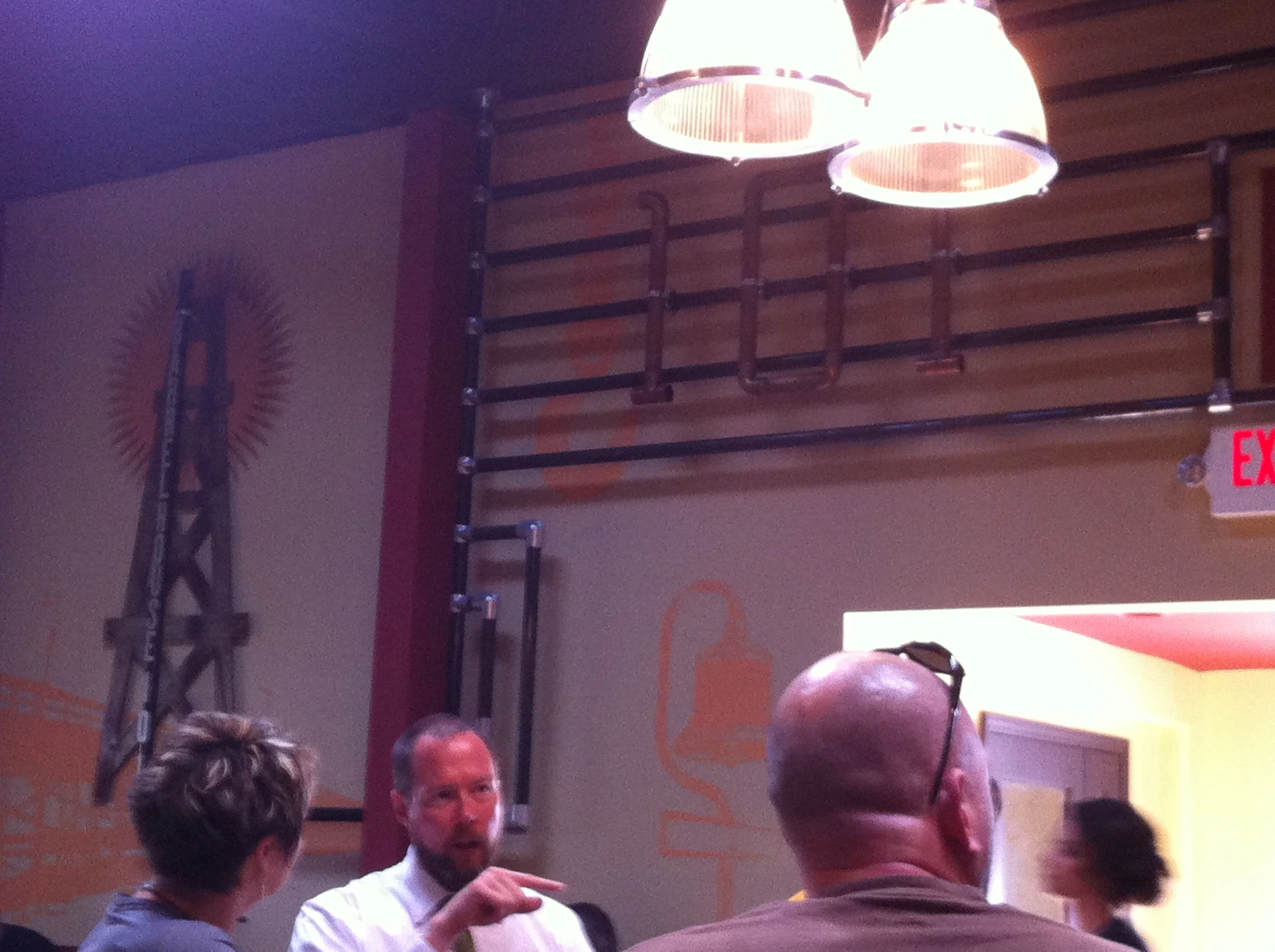
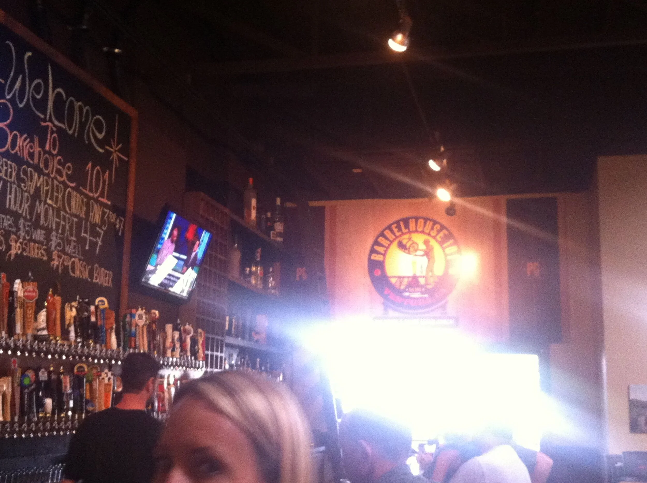
A typical scene inside Barrelhouse 101. Here are patrons congratulating the latest winner of the BH101 Hot Wing Challenge!
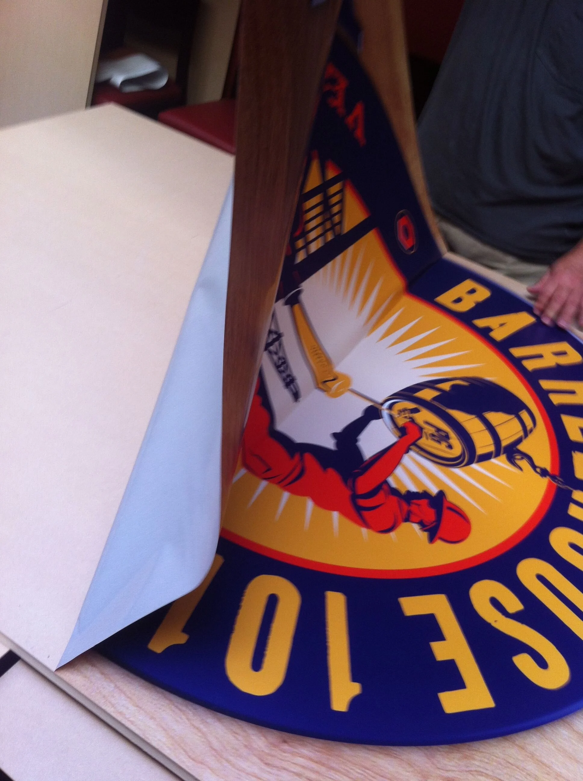
I applied the vinyl to each plywood frame making sure to remove any air pockets.
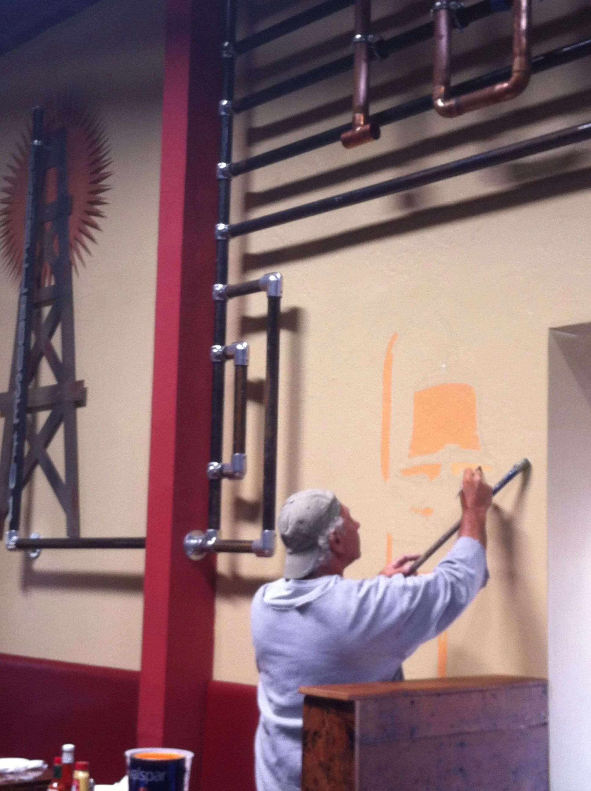
I sourced a local artist that lived on a boat. Here he is painting the California Mission Bell.
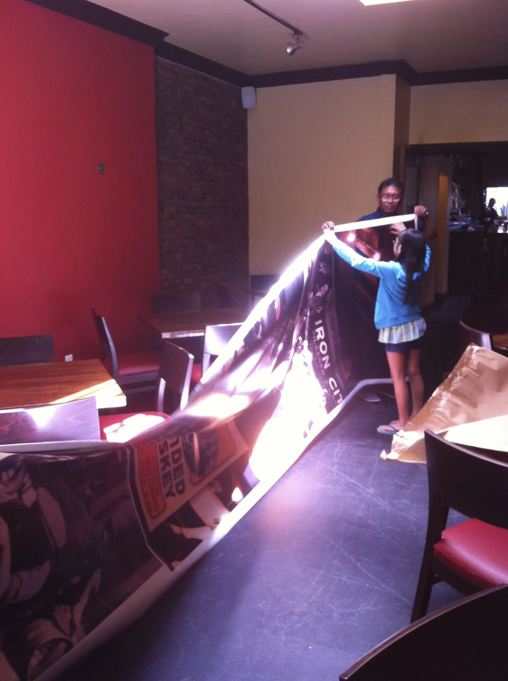
I asked my daughter to hold up one of the mural wall graphics. Haha.
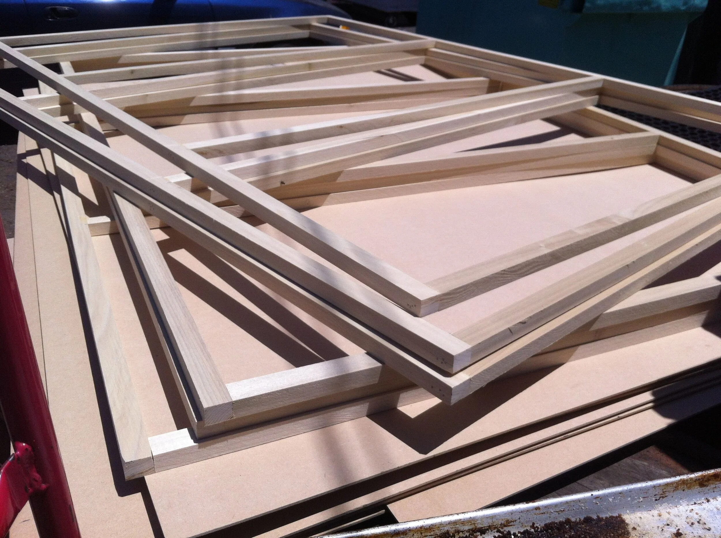
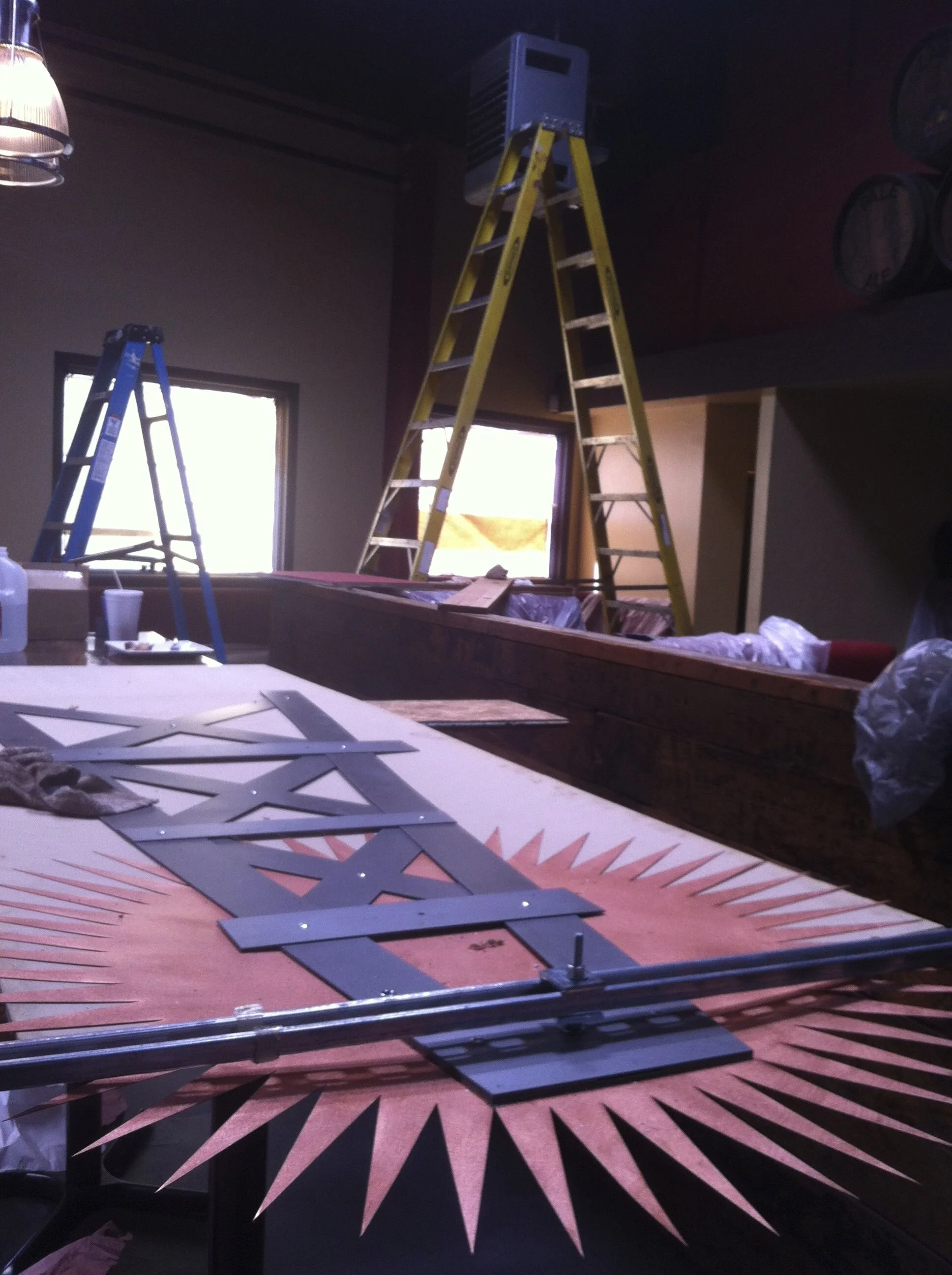
A local carpenter constructed several panels as a base for vinyl graphics.
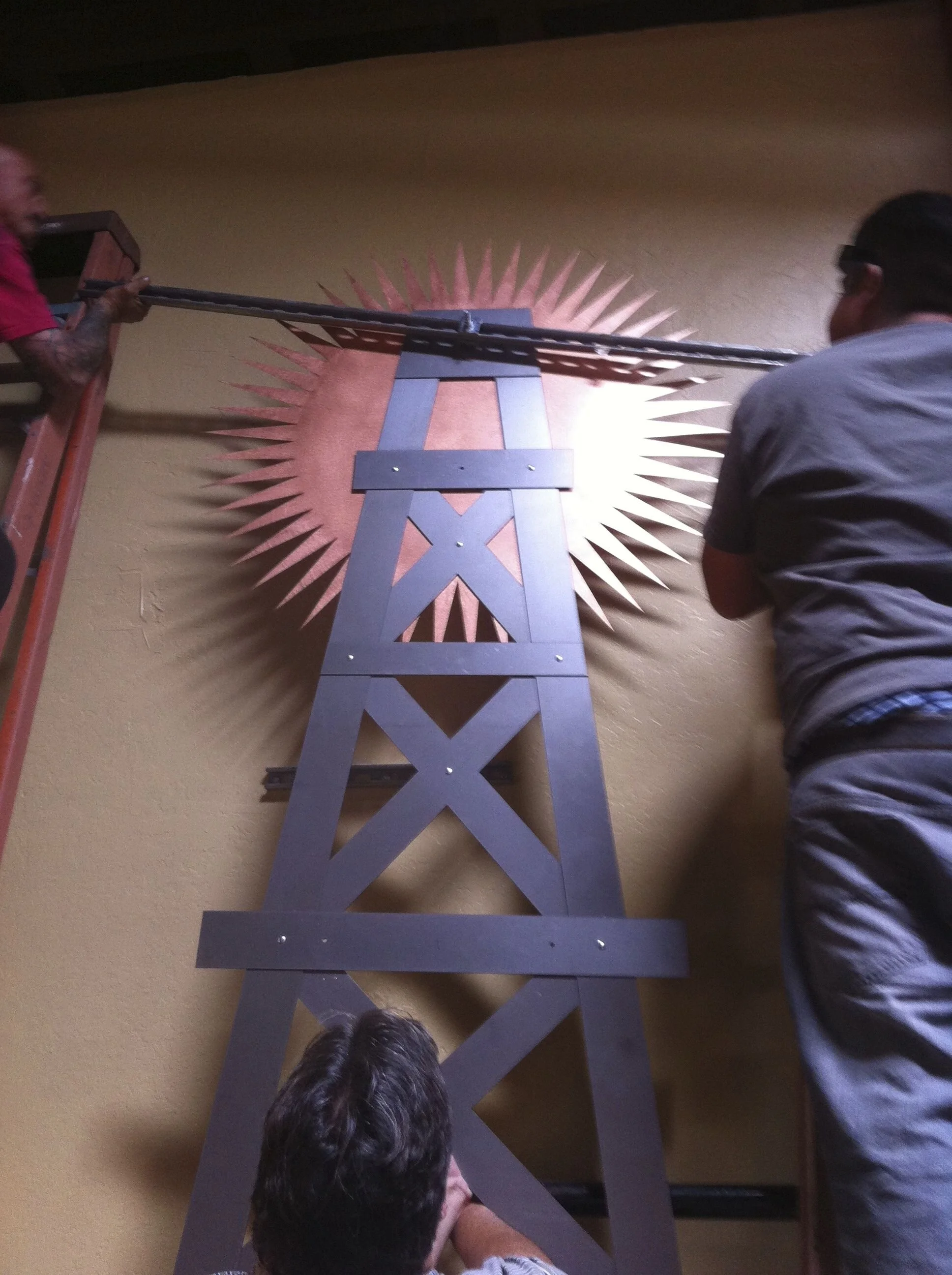
The oil rig and sun ties in to the City of Ventura. I used a local company to perform waterjet cutting out of aluminum.
Mounted onto the oil rig are aluminum letters with the Barrelhouse 101 name. "101" was made from copper tubing.
Logo panel mounted above bar.
One of four main mural walls to express the prohibition history in the city. Misc art were sourced on Etsy.
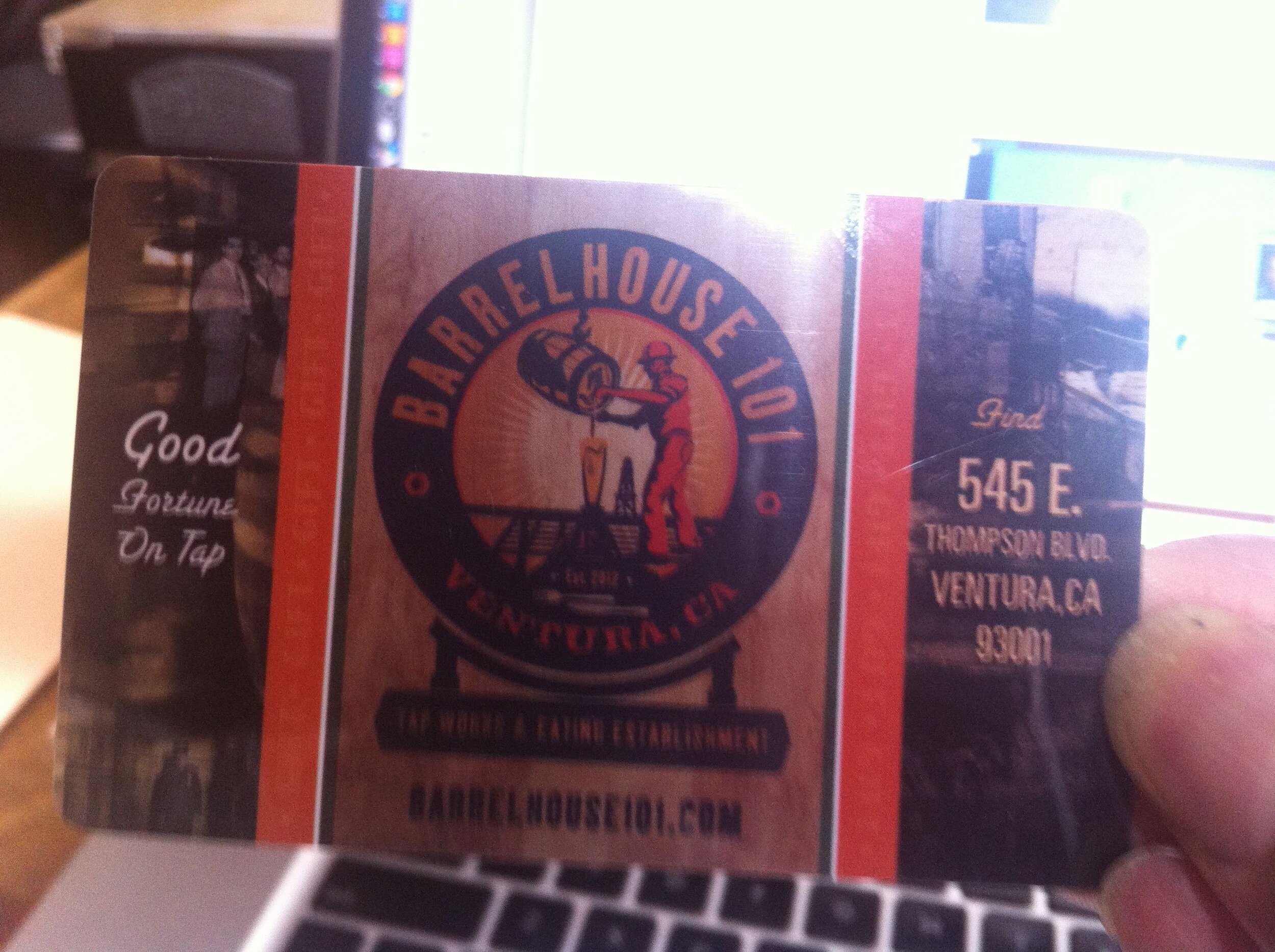
The official Barrelhouse 101 gift card.
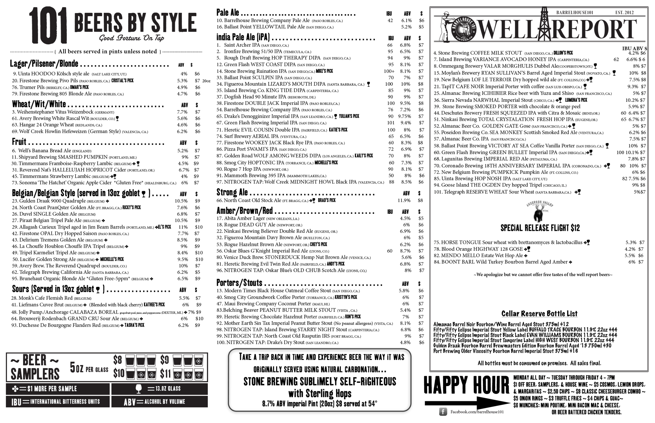
I updated the beer menu on a weekly basis for both print and website.
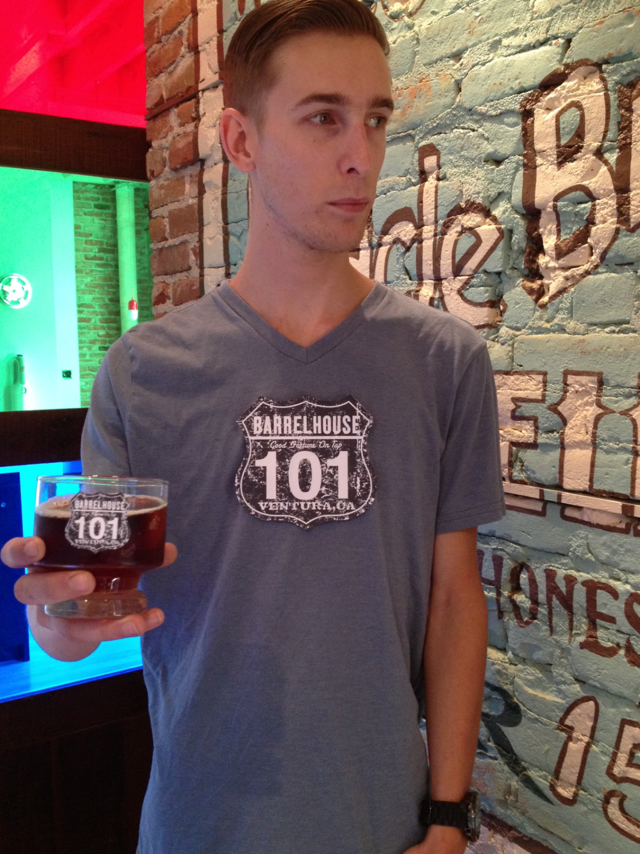
My intern modeling some swag.
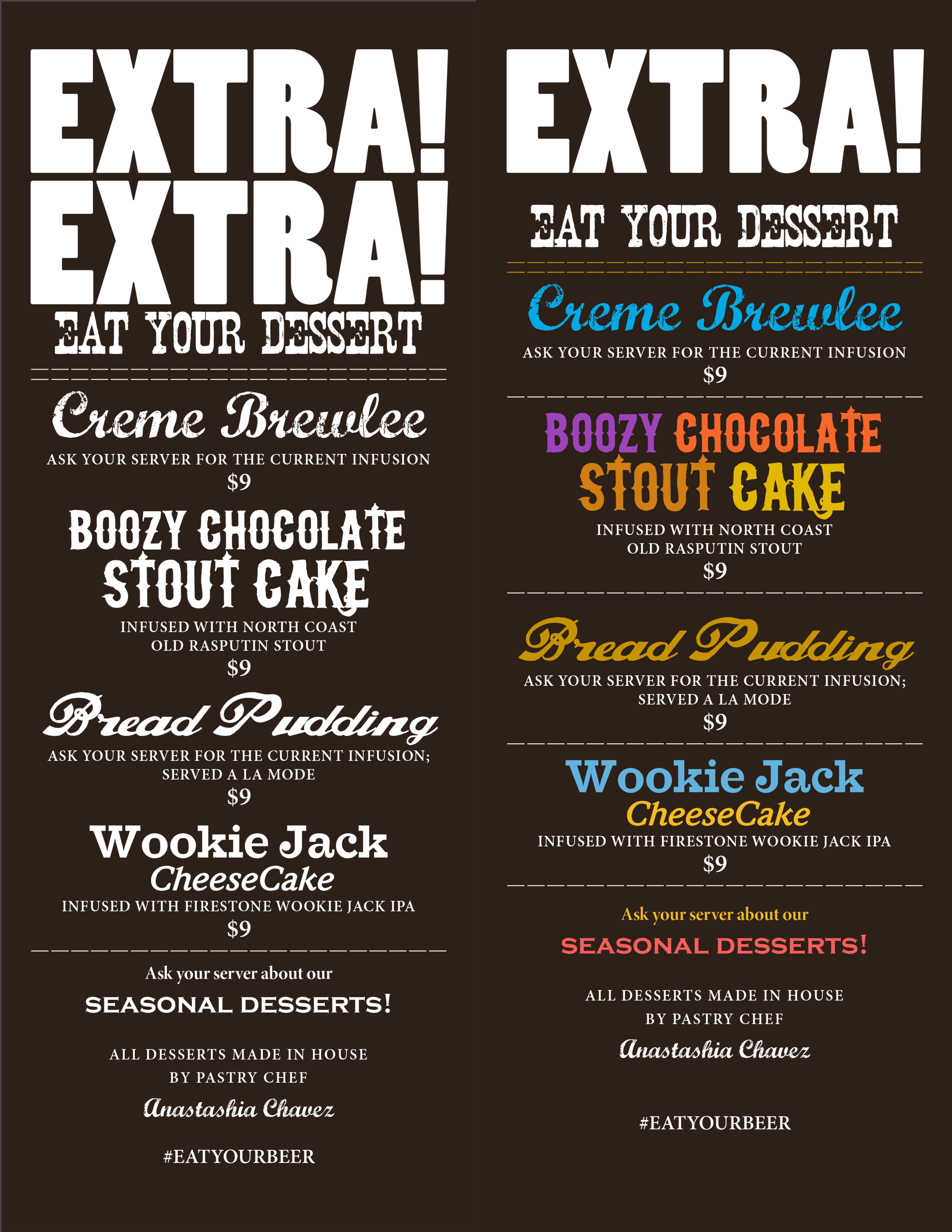
All desserts incorporated a beer as an ingredient. A strong vintage headline announces the dessert menu. Colors and font styles are playful and celebrates the sweetness at the end of an amazing meal.
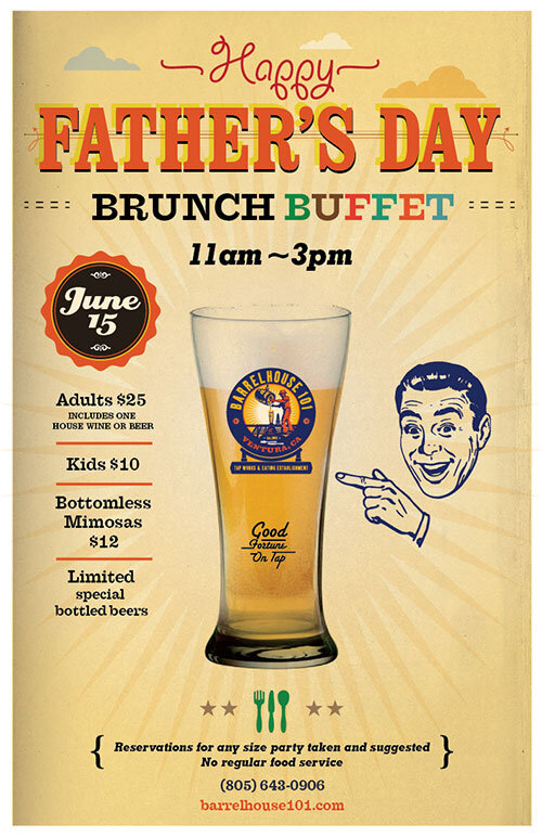
For the Father's Day event poster, flyer, and web banner, I wanted to have a retro fun feel to evoke feelings of fathers and grandpas reflecting back to a fun past with their fathers.
One of the many event graphics to attract customers. Posters and flyers were posted around town and on Facebook and Twitter.
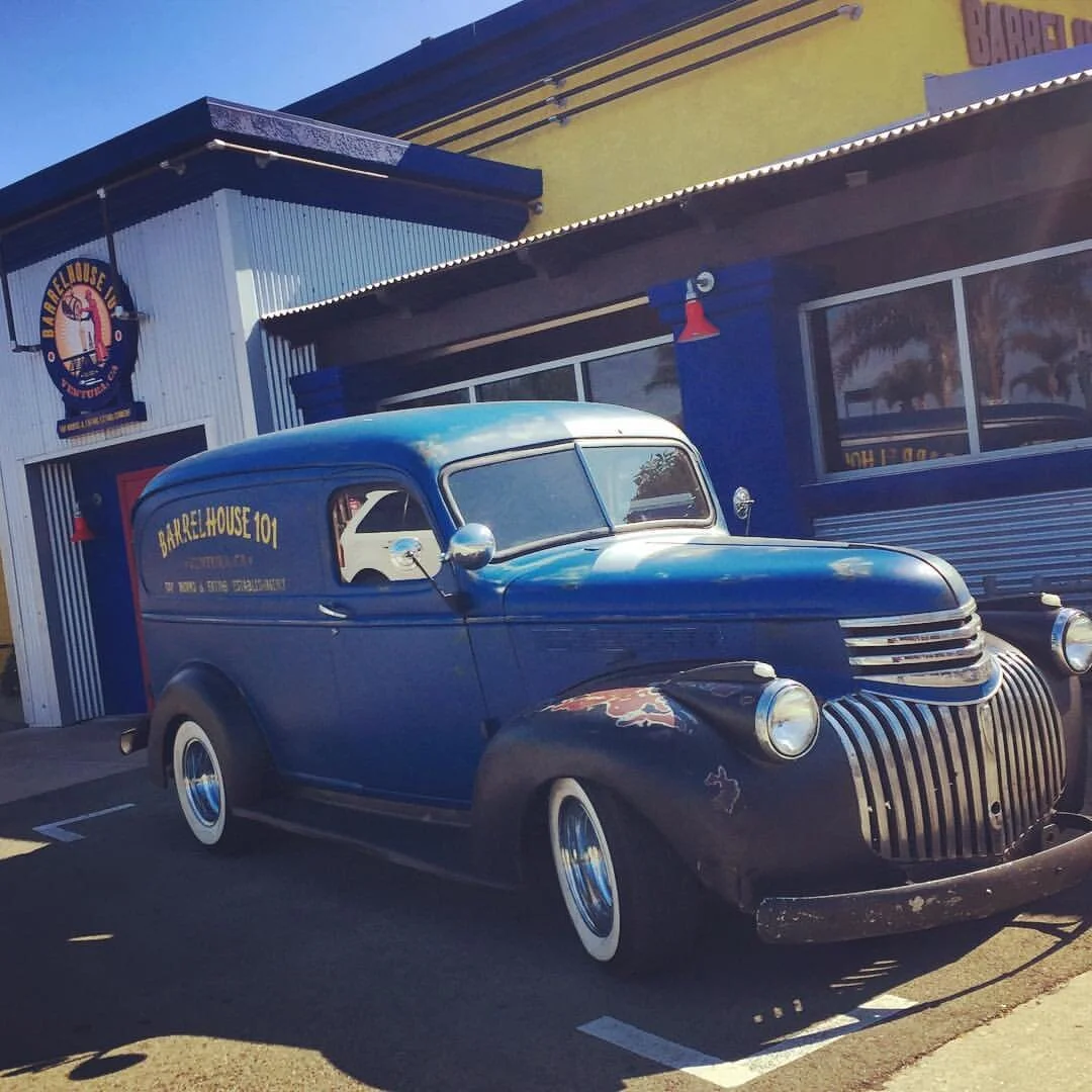
Although I would like to take credit for the BH101 beer mobile, I cannot. LOL. The owner made the investment to create a vintage car built with a cooler and beer taps designed for beer festivals around Southern California to spread the brand.
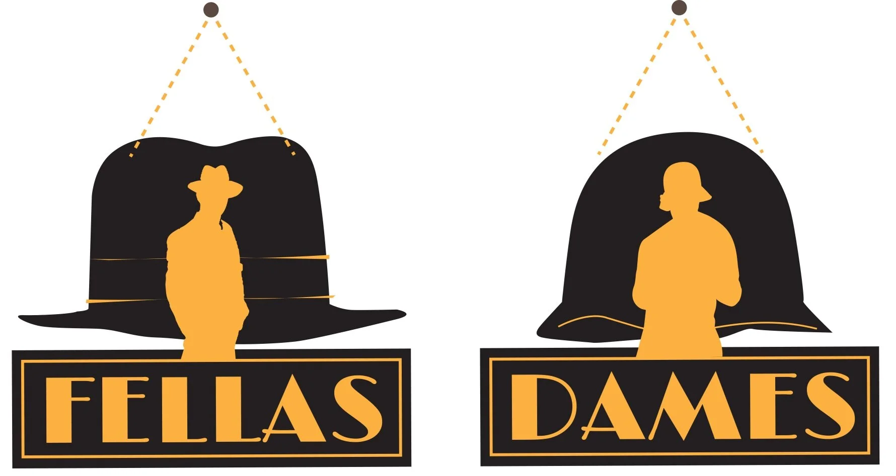
Custom bathroom signs were inspired by Bonnie and Clyde as well as the prohibition era. The final products where produced out of wood painted in black and gold. A copper chain added the final touch.